Gamification and interactive email: 9 examples built with Betty
Nine interactive email examples we built with Betty, from a spin-the-wheel and a scratch card to a live countdown and a quiz, with the prompts we used and what works in which inbox.

Nicki Pabst Rasmussen

Gamified emails, like a prize wheel, a scratch card or an advent calendar, take a lot of work. Few inboxes support interactive email, someone has to draw the animation in Photoshop, and someone has to code a fallback for the clients that can't play it. Services with prebuilt wheels and countdowns save the drawing, but their designs don't match your brand.
With Betty, our AI agent, we describe what we want and she makes it. She knows what each email client can show, and she works from your design system, so the colours and fonts are already yours. You get a custom asset to use once, or a module your team can reuse.
That works because a design system in Better Email has no fixed set of building blocks. Modules are written in HTML, so anything that works in an email client can be built, including every interactive piece in this post.
Every example in this post was made for Vandra, the outdoor brand we use for demos, with Vandra's design system. This is one of its campaigns:
Where interactive email works
| Technique | Where it works | What it takes |
|---|---|---|
| AMP for Email | Gmail, Yahoo, AOL, Mail.ru and FairEmail | You register as a sender with the mailbox providers, and your ESP has to send the AMP version. Most ESPs can't. |
CSS checkbox trick (:checked) | Apple Mail | Gmail strips it and Outlook.com breaks it, so everyone else needs a fallback. |
| Animated GIF | Almost every email client | Outlook for Microsoft 365 on Windows plays a looping GIF three times, then pauses it behind a play button. Outlook 2007 to 2019 show only the first frame. |
Only the GIF plays for nearly everyone on your list, and it needs no sender registration or ESP support.
Motion in the email, interaction on the landing page
The email shows the motion, and the click takes the reader to a landing page where the interaction happens. These patterns all work that way:
- Spin-the-wheel. The wheel spins in the email. The whole image links to a page that draws the prize.
- Scratch to reveal. The foil comes off in the GIF and shows an offer or a code.
- Countdowns. A live timer counts down to the deadline from the moment the email is opened, and the click goes to the sale.
- Progress bars. A bar fills to show how close a member is to the next tier. Make one GIF per step and let your ESP pick the image from a profile field, as the membership example below does.
- Quizzes. Each answer is its own button with its own link. The landing page says whether the answer was right, and the click tells you what each person picked. In Apple Mail a quiz can also run inside the email, as the quiz example below shows.
None of them can pick a random prize per person, because a prize GIF is drawn once and plays the same for every recipient. The prize is decided on the landing page after the click.
How we built these with Betty
Betty draws the frames in your design system's colours and fonts, puts the GIF together, and shrinks it to fit a size limit. Here are the prompts we gave her and what came back. The docs explain how to ask Betty for a GIF.
Spin-the-wheel
We asked Betty
Make a spin-the-wheel teaser GIF in our brand colours
Betty made
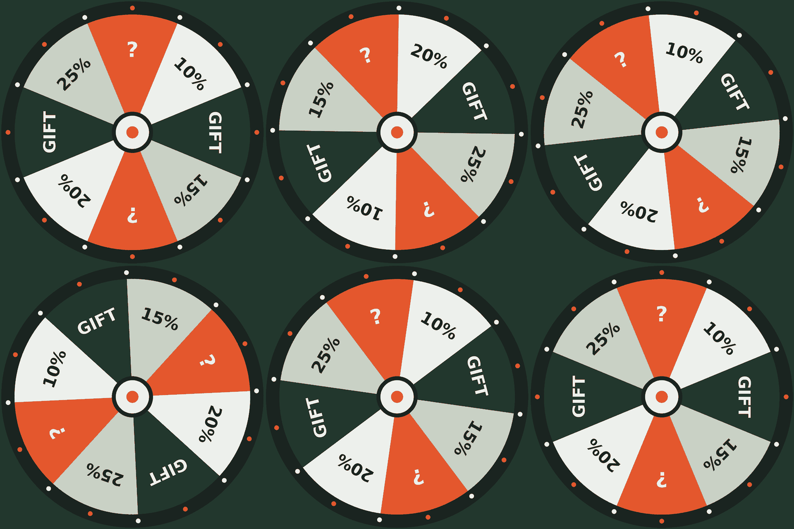
Betty built a whole module around the wheel: a label, a heading, a line of copy, a pointer above the image, and a button that sets a reminder. The pointer sits in the module, so the GIF itself has none. The email is a teaser: it announces the spin, and the spin itself happens on the landing page.
The copy, the image and the button are all settings, so the team can swap in another wheel or change the offer without touching code. A switch makes a still wheel image spin with CSS in Apple Mail and iOS, for teams that would rather not send a GIF. Older Outlook versions on Windows show only the first frame, which is still a whole wheel. 640 × 640 pixels, 825 KB, 4.5 seconds.
Gift box reveal
We asked Betty
Make a 3-second animated GIF of a gift box that shakes, opens and reveals '20% OFF'. Brand colours, 600px wide, under 800 KB. The first frame has to make sense on its own for Outlook.
Betty made
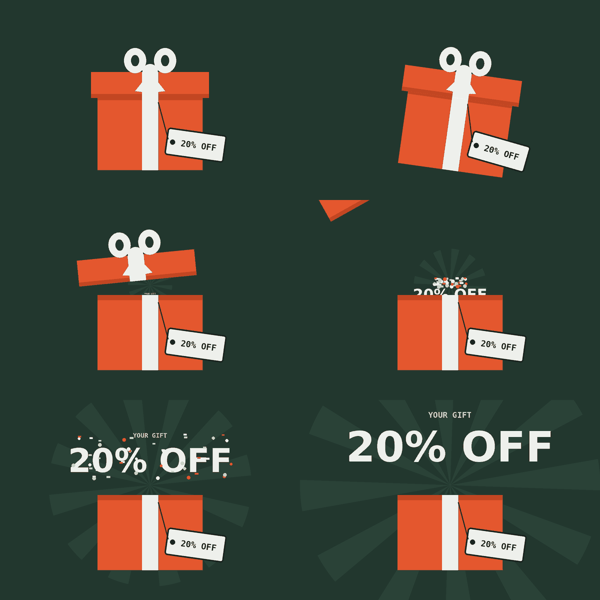
For the Outlook rule, Betty hung a tag with the offer on the closed box, so the first frame already says 20% OFF. The GIF runs exactly 3 seconds and weighs 211 KB, about a quarter of the limit.
She put it in a module with the offer repeated as live text: a heading, a line of copy, the code GIFT20 in a box, and a button.
Scratch card
We asked Betty
Make a scratch-card GIF: a silver foil layer gets scratched away in a few random strokes to reveal the offer underneath.
Betty made
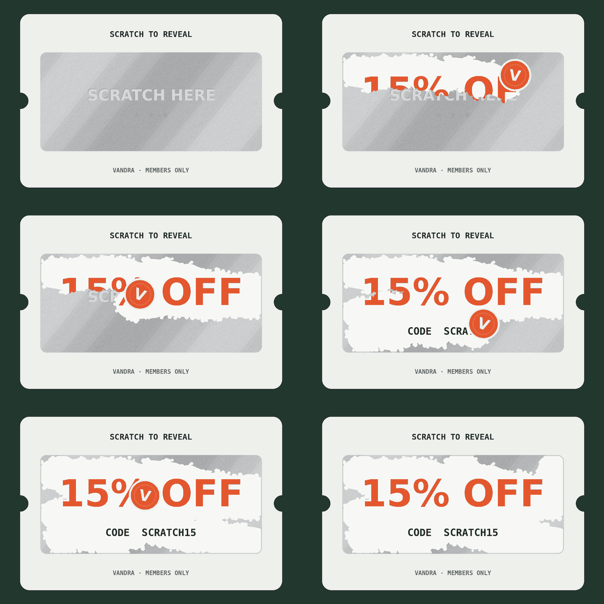
The strokes are random when Betty draws them, and then the same for everyone who opens the campaign. 600 × 400 pixels, 166 KB, 5 seconds.
The prompt didn't mention Outlook, and Betty handled it anyway. The first frame is all foil, so older Outlook versions on Windows show an unscratched card. In the module she built around the GIF, the offer and the code are repeated as live text under the card, and a note in the settings says why.
Advent calendar
We asked Betty
Make an advent calendar for December: one door GIF per day in our brand colours that opens to show that day's product. Build it as a module where we pick the day and the product image.
Betty made
Betty made all 24 door GIFs and a module to go with them. The marketer picks the day on a "Today's door" slider, and the date, the heading and the "Door 2 opens tomorrow" line follow from it. Behind the door go the product image, a title, a line of copy, a discount code and a button. A "Custom door GIF" field swaps in a different door for a one-off, and a switch adds a grid of the whole calendar with the earlier doors opened.
The product photo and the door GIF sit in the same spot. The photo is the background of a 560 × 400 box, and the GIF lies on top at the same size. As the doors swing open, the GIF turns see-through where they were, and the photo shows through. It plays once and stops open.
Layering them has two advantages over one GIF with the product baked in:
- One door works with any product. The doors don't know what's behind them, so you can change the product up to the last minute without a new GIF.
- The photo stays sharp. A GIF holds 256 colours, so a product photo inside one looks grainy and weighs more. The door GIF only holds flat green, orange and white, and stays at 330 KB.
The HTML behind the doors
Stripped down to the parts that make the trick work:
<!-- The product photo sits underneath as a background image.
     The door GIF sits on top and turns see-through as the doors open. -->

<!--[if mso]>
  <!-- Outlook for Windows can't do the layering, so it just gets the photo -->
  <img src="https://example.com/product.jpg" width="560" height="400"
       alt="Behind door 1: our SKARV 38 pack" style="display:block; border:0;" />
<![endif]-->

<!--[if !mso]><!-->
<table cellpadding="0" cellspacing="0" border="0" width="560">
  <tr>
    <!-- Bottom layer: the product photo -->
    <td background="https://example.com/product.jpg"
        style="background-image:url(https://example.com/product.jpg);
               background-size:cover;
               background-position:center;
               background-color:#22372E;">

      <!-- Top layer: a GIF with see-through areas where the doors open -->
      <img src="https://example.com/door-01.gif" width="560" height="400"
           alt="Behind door 1: our SKARV 38 pack"
           style="display:block; border:0; width:100%; height:auto;" />

    </td>
  </tr>
</table>
<!--<![endif]-->
Three things make it work:
- The GIF has see-through areas. Every frame is exported with a transparent colour and set to clear before the next one, so the photo shows through as the doors swing away.
- Both layers are the same size. The photo and the GIF are both 560 × 400, so the opening lines up with the picture behind it.
- Outlook gets a backup. Outlook on Windows handles background images badly, and older versions show only the first frame of a GIF. The
[if mso]block gives it just the photo, so nobody is stuck looking at closed doors.
The trick needs the inbox to show background images. Apple Mail, iOS Mail, Gmail and Outlook.com do. An inbox that doesn't would show the doors opening onto plain green, so check in your test send that the product appears behind the doors. With images off, the reader sees the green box and the alt text. The product name and code under it are live text, so they show either way.
Membership progress bar
We asked Betty
Make a progress bar module that shows each recipient's membership level: Bronze, Silver or Gold. Animate it as a GIF, with the bar filling up to their level. I need to set which merge tag holds the level, and to preview all three versions.
Betty made
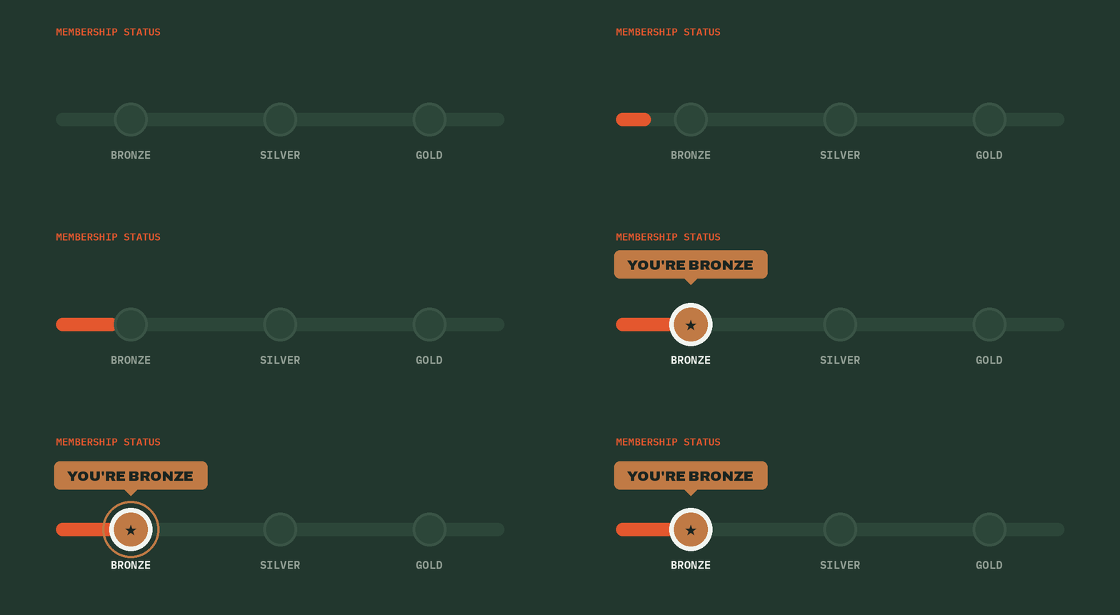
Betty drew one GIF per level, with the bar filling up to the member's tier and stopping there. The module reads the level from a field in SFMC when the campaign is sent, so each recipient gets the GIF, the heading and the copy for their own level.
That gets around the limit from earlier. Each GIF still plays the same for everyone who receives it, but which GIF a recipient gets depends on their membership.
Each GIF is 1200 × 440 pixels for sharp screens, about 22 KB, and plays in 4.4 seconds.
Live countdown
We asked Betty
Can you make a live countdown to Black Friday?
Betty made
This is the timer Betty made. The one in this post always counts down to the coming Friday at 18:00 Copenhagen time. In the module you set the exact date and time. Like in an email, it stops after a minute, and Start again loads a new one.
Betty built a module around the timer: a label with the date, a heading, a line of copy and an early-access button. The date is in the copy as well as in the timer, so readers with images off still know when the sale starts.
The timer is a GIF that a server draws when the email is opened. It starts at the time left at that moment and counts down for one minute, one frame per second. Open the email again and it starts from the new time.
The deadline can also be different for each recipient, such as the end of their free trial. The date comes from a field on the recipient, and your ESP fills it in when it sends.
Older Outlook versions on Windows show only the first frame, which is the time left when the email was opened, so the number is still right. Outlook for Microsoft 365 plays it once and stops.
Once the deadline has passed, the server sends this image in place of the timer, so a campaign opened late doesn't show a row of zeros:

Save the date with a calendar file
We asked Betty
Make a save-the-date module for Vandra Trail Day on Saturday 14 November, 10:00 to 15:00 at Frognerseteren in Oslo. Add buttons so people can put it in their calendar, whichever calendar they use.
Betty made
Betty built the module and wrote the calendar file herself. There are three buttons, because calendars take events in different ways:
- Apple & Outlook opens a calendar file (.ics), which Apple Calendar and Outlook on desktop open as a new event.
- Google Calendar and Outlook.com open a new event in the browser with the title, time, place and notes filled in.
The file stores the time in UTC, so the event lands at 10:00 Oslo time in any reader's time zone. Betty also added a reminder the day before.
Open the calendar fileThe file doesn't change once it's made. If the event moves, a note in the settings tells the team to ask Betty for a new one, so the file and the date in the copy always match.
There is more on how each kind of calendar link works in Calendar links in email.
The calendar file Betty wrote
BEGIN:VCALENDAR
VERSION:2.0
PRODID:-//Vandra//Save the date//EN
CALSCALE:GREGORIAN
METHOD:PUBLISH
BEGIN:VEVENT
UID:[email protected]
DTSTAMP:20261018T120000Z
SEQUENCE:0
STATUS:CONFIRMED
TRANSP:OPAQUE
DTSTART:20261114T090000Z
DTEND:20261114T140000Z
SUMMARY:Vandra Trail Day
LOCATION:Frognerseteren\, Oslo
DESCRIPTION:A free day on the trails with the Vandra crew. Guided hikes fo
 r every pace\, gear to try\, and hot coffee at the finish. Details: https
 ://vandra.example/trail-day
URL:https://vandra.example/trail-day
BEGIN:VALARM
ACTION:DISPLAY
DESCRIPTION:Vandra Trail Day is tomorrow
TRIGGER:-P1D
END:VALARM
END:VEVENT
END:VCALENDAR
DTSTART and DTEND are in UTC, which the Z marks. Commas in the text are escaped with a backslash, long lines carry on after a space on the next line, and the VALARM block is the reminder.
Quiz with the CSS checkbox trick
We asked Betty
Create a new Module called "Find your trail quiz" that uses the checkbox hack (hidden radio buttons and labels) to run a 3-question quiz inside the email. Questions, shown one at a time with a "Question 1 of 3" progress line. Each answer is a full-width tappable button: How long are you out? Just the day / A few nights What's the weather doing? Dry and clear / Wind and rain What's under your feet? Easy paths / Rocky ground Results: after the last answer, show a product card with image, name, price, one line on why it fits, and a Shop button.
Betty made
This is Betty's module, and the quiz works here the way it does in Apple Mail. Each answer is a label for a hidden radio button, and CSS shows the next question once a button is checked. Three questions with two answers each make eight paths, and Betty mapped them to four products.
She also gave the module a fallback without being asked. Gmail strips the trick and Outlook breaks it, so in those inboxes the reader gets all four products, each with a line on when it fits. Switch to the Gmail and Outlook tab to see it.
The fallback works because the module tests the inbox first. It starts with a hidden checkbox that is already checked. Where :checked works, CSS hides the static list and shows the quiz. Where the inbox strips the checkbox or ignores :checked, nothing matches, and the static list stays.
The CSS and HTML behind the quiz
With the Vandra styling taken out:
<style>
  .quiz, .step2, .step3, .result { display: none; }
  /* The quiz only appears if the inbox kept the checkbox and supports :checked */
  .detect:checked ~ .quiz { display: block !important; }
  .detect:checked ~ .fallback { display: none !important; }
  /* Answering question 1 hides it and shows question 2 */
  #q1a:checked ~ .quiz .step1, #q1b:checked ~ .quiz .step1 { display: none !important; }
  #q1a:checked ~ .quiz .step2, #q1b:checked ~ .quiz .step2 { display: block !important; }
  /* Each combination of answers shows one product */
  #q1b:checked ~ #q2a:checked ~ #q3a:checked ~ .quiz .result-pack { display: block !important; }
</style>

<input type="checkbox" class="detect" checked style="display:none">
<input type="radio" name="q1" id="q1a" style="display:none">
<input type="radio" name="q1" id="q1b" style="display:none">
<!-- Same pair of radio buttons for questions 2 and 3 -->

<div class="fallback">All four products, each with a line on when it fits</div>

<div class="quiz">
  <div class="step1">
    <label for="q1a">Just the day</label>
    <label for="q1b">A few nights</label>
  </div>
  <!-- step2, step3, and one result card per product -->
</div>
The inputs have to come before the quiz in the HTML, because the ~ selector only reaches elements that follow.
Colour picker
We asked Betty
Create a new interactive module: a product colour picker. Show one product with a swatch for each colour. Tapping a swatch swaps the photo, the colour name and the Shop button, so the button links to the colour the reader picked. Let us add colours in the settings, each with a name, a swatch colour, an image and a link.
Betty made
This is the checkbox trick with a single question. Each swatch is a label for a hidden radio button, and picking one swaps the photo, the colour name and the button, so "Shop in Navy" links straight to the navy version.
In Gmail and Outlook the reader sees the first colour, and the swatches are links to each colour's product page, so a tap still goes somewhere.
The CSS and HTML behind the colour picker
It uses the same test checkbox and fallback as the quiz. The picker itself is one set of radio buttons, with one rule per colour:
<style>
  .photo, .info { display: none; }
  /* One block like this per colour */
  #navy:checked ~ .picker .photo-navy,
  #navy:checked ~ .picker .info-navy { display: block !important; }
  #navy:checked ~ .picker .swatch-navy { box-shadow: 0 0 0 2px #1A2420 !important; }
</style>

<input type="radio" name="colour" id="sand" checked style="display:none">
<input type="radio" name="colour" id="navy" style="display:none">

<div class="picker">
  <img class="photo photo-sand" src="sand.jpg" alt="FJELL MERINO ZIP in Sand">
  <img class="photo photo-navy" src="navy.jpg" alt="FJELL MERINO ZIP in Navy">

  <label for="sand" class="swatch swatch-sand" title="Sand"></label>
  <label for="navy" class="swatch swatch-navy" title="Navy"></label>

  <div class="info info-sand"><a href="https://example.com/merino?colour=sand">Shop in Sand</a></div>
  <div class="info info-navy"><a href="https://example.com/merino?colour=navy">Shop in Navy</a></div>
</div>
The first radio button starts checked, so a colour shows before anyone taps.
Before you send
- The first frame works alone. Outlook 2007 to 2019 on Windows stop there, so it should show the offer or a complete picture.
- The GIF ends on the offer. Outlook for Microsoft 365 plays a looping GIF three times and then pauses it behind a play button, so the frame it stops on should still say what the campaign offers.
- The GIF is under about 1 MB. Large GIFs load slowly on mobile data. Ours range from 21 KB to 825 KB.
- The alt text describes the offer. "Spin to win up to 25% off" tells a reader with images off or a screen reader what the campaign offers. "Wheel" doesn't.
- Nothing flashes more than three times a second. Faster flashing can trigger seizures. A GIF also ignores the reduced-motion setting some readers turn on, so keep the motion short or let the GIF play once and stop.
- The deadline is in the copy too. A live timer is an image, so it's missing when images are off. A line like "Our best prices start Friday 27 November" works in every inbox.
- The whole image is a link, and the landing page matches the GIF. If the wheel promises up to 25% off, the page has to hand out a real prize.
Try it with your design system
Ask Betty for a wheel, a countdown or an advent calendar in your own design system. The docs cover images, GIFs and calendar files and countdown timers. See what Betty does, or book a demo and we'll show it with your brand.


